
You Can’t Argue With Statistics – Or Can You?
Statistics are an incredibly useful tool to help make decisions. That is, unless you’re using them to fuel a false narrative

“The most difficult subjects can be explained to the most slow-witted man if he has not formed any idea of them already; but the simplest thing cannot be made clear to the most intelligent man if he is firmly persuaded that he knows already, without a shadow of doubt, what is laid before him.” -Tolstoy
Statistics have become an increasingly-powerful part of our society. Whether in sports, finance, or even everyday life, there are more and more numbers being thrown around in order to get us to understand someone’s point of view or agree with their opinion. As business leaders, we are often bombarded with various data points when we’re trying to make major decisions.
In the last few years, that amount of data launched in our faces has been remarkable. Just within the sports world, for example, the rise of advanced statistics has been unmatched. Even many old-school newspaper beat writers are now utilizing previously-unknown data such as wRC+, DVOA, Fenwick, and eFG1 to support their theses.
But now that the use of statistics has become mainstream, people have also become quite good at cherry-picking data to support their narrative. This can get extremely dangerous, especially since people are liable to believe someone who has impeccable credentials and/or sounds like they know what they’re talking about.
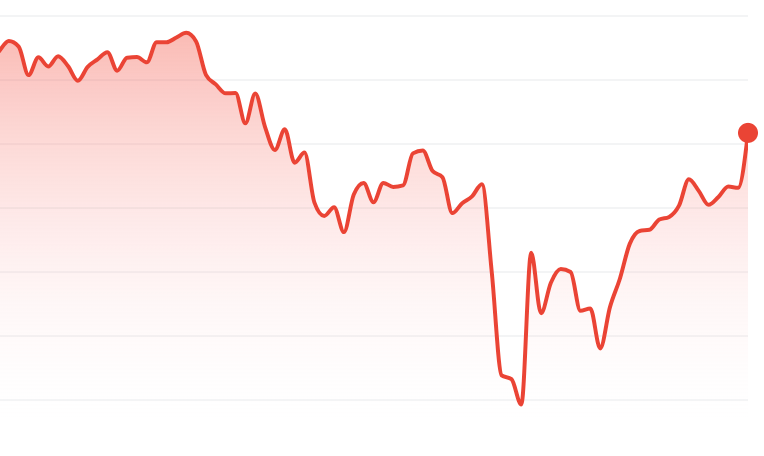
Here’s a basic example. Take a look at the two charts below. They show the returns of the S&P 500 during Donald Trump’s second term as president. People on the left are more likely to show the first chart, which shows that the stock market has decreased during the first few months of his term.
People on the right, however, will use this chart to show that the stock market has skyrocketed in recent weeks.
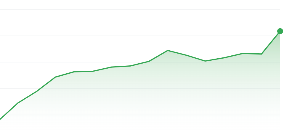
The first chart is from January 21, 2025 to May 11, 2025, while the second chart is from April 21, 2025 to May 12, 2025. Both charts are accurate – none of the numbers are falsified, there was no photoshop, there is no skewing of data. The only thing that has changed is the story that the presenter wants to tell. If someone wants to tell a story that President Trump’s policies have been horrific for the economy, they use the first chart. If someone wants to show that his policies have been a boon for investors, they use the second chart. Neither one is wrong: they are both using accurate statistics. But surely, no one would think that either of these people are being fully transparent. There are also plenty of examples you can find of people cutting up the beginning or end of a bar chart in order to prove their point. The data isn’t technically inaccurate. But it’s up to the consumer of that data to demand the full picture and make their own judgments.
Perhaps the greatest living example of this is a study that was performed by Dr. Robert Yeh of the Beth Israel Deaconess Medical Center, a teaching hospital at Harvard Medical School. While on a plane, he realized that scientific research had never actually tested the usefulness of parachutes when jumping from an airplane. We’ve just always assumed that they work, because people always wear them, and the vast majority of those people survive their plummets to earth. But correlation does not equal causation, so Dr. Yeh wanted to determine once and for all what the deal was.
He recruited dozens of volunteers who were willing to be randomly assigned to a “parachute” or “no parachute” group. Each group received a backpack, but no one knew whether their backpack contained a parachute or nothing at all. They then jumped from the wing of a plane, and the researchers recorded whether or not they survived the jump, as well as any potential injuries.
Remarkably, their results found that there was no difference between the two groups. Each group had the same rate of death and rate of injury - and the study concluded that parachutes provide no additional protection when jumping from a plane. The BMJ (formerly known as The British Medical Journal) published Yeh’s study in their Christmas 2018 issue, and the results quickly went viral.
Now, you obviously know something is fishy here. But if you read the actual journal article, which is in a peer-reviewed medical publication, it all sounds legitimate. The title, “Parachute use to prevent death and major trauma when jumping from aircraft,” sounds like a typical journal article. The abstract (the pre-article summary) reads just like any other. And if you read the article top to bottom, everything seems kosher for almost the entirety of its manuscript. I’ve read hundreds of journal articles, and this one was passing muster – except something just didn’t seem right.
The payoff comes right at the end just before the conclusion. In a discussion about the results and the data charts created from them, specifically the altitude of the plane, Yeh throws in some statistical data in perfect journal format: “(0.6m, SD 0.1).” That’s a statistical endnote showing that the average height from which the participants jumped was 0.6 meters, or two feet.
Which brings us to a photo Yeh took of the study in action:

Okay, we chuckle a bit, that’s really cute, ha ha. But remember: every single part of the journal article was technically accurate. There were no fake numbers, no made up statistics, the study itself was 100% real and followed all of the journal’s rigorous guidelines. The only caveat was in the methods, or the design of the study. At face value, no one would know that the study was conducted with people stepping off the wing of a plane and onto the ground. Even the last line of the article was satirically perfect. In the typical style of explaining how the study could or couldn’t be generalized to the real world, he concluded with what he referred to as a “minor caveat”: “While we can confidently recommend that individuals jumping from small stationary aircraft on the ground do not require parachutes, individual judgment should be exercised when applying these findings at higher altitudes.”2
Sure, because we have brains we instinctively know that no one could jump off of a plane without a parachute and expect to live. But that’s the beauty of this satirical study: if this exact strategy was used on a topic for which we have little to no common knowledge, how would we know that the study was skewed in such a way that guaranteed a technically-incorrect result? In this case, most medical professionals knew that the Christmas issue of The BMJ is the annual “fun” issue, where they publish studies that wouldn’t otherwise get published, including satirical ones such like Yeh’s.
Studies are published daily in the medical world. Most of them are on topics we will never understand, but some have quite serious, if not dangerous implications. Let’s take something totally uncontroversial, like vaccines and autism.3 Without getting too into the weeds, this controversy began in 1998 when a doctor published an article in The Lancet, a British medical journal, showing an implied link between the MMR vaccine and autism. That fueled a media narrative on the fringes and conspiracy theories that have led to vaccination rates dropping in recent years, as well as higher-than-usual skepticism when the COVID-19 vaccines were approved by the FDA.
However, that original journal article, which, again, at face value reads like a legitimate study, was withdrawn by The Lancet in 2010. The journal looked deeper into the study’s methods and found that the 12 children/participants in the study were carefully selected (and not randomly assigned), and the study was funded by a group of lawyers representing parents who were already involved in lawsuits against vaccine manufacturers. Perhaps worst of all, they had reason to believe Wakefield faked his data in order to achieve his intended result. He ended up losing his U.K. medical license, and no other study since has been able to show a legitimate link between vaccines and autism.
An in-depth prodding of this paper by The Lancet in the first place likely would have uncovered all of this, as would a basic “intro to psychology” level of skepticism. Take a look at this chart, of which most of the vaccine conspiracy theories are based:
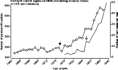
The chart shows a correlation between the number of autism diagnoses and the number of people receiving the MMR vaccine. As you can see, the numbers skyrocket together. The logical conclusion, and the way you would phrase this in a journal article is, “the more people that received the MMR vaccine, the more people that were diagnosed with autism.” But that’s not the same as “the MMR vaccine causes autism.” Those are two completely different statements and completely different statistical analyses. You can get many unrelated things to correlate with one another:

Autism diagnoses are also correlated with organic food sales. While I’m sure there is someone out there that would believe that organic food causes autism, I can safely assume that most of us agree this chart is ridiculous. Ice cream sales are correlated with drownings (because both naturally increase in the summer months). Arcade revenue is correlated with the number of computer doctorates awarded (because both increased dramatically during the 2000s). The per capita consumption of margarine is correlated with the divorce rate in Maine (no freakin’ idea). Correlation does not imply causation. It’s one of the first things you learn in psychology.
Unfortunately with statistics, the beauty often lies with the beholder. If a study was later found to be untrue, whether or not you adjust your understanding is dependent on your actual opinion in the first place. A vaccine skeptic would not believe the withdrawal of the vaccine-autism paper, and would assume there was some conspiracy to hide the truth about MMR vaccines. But would that same person have the same skepticism if a journal article reporting a link between DEI initiatives and financial performance was later withdrawn for the same academic reasons?
Perhaps the most important advice I can give is this: don’t let your existing opinions blind you to a statistic that supports your opinion. That’s called “confirmation bias”, and it’s one of the biggest cognitive errors a leader can make, especially if they’re making decisions that can determine a company’s fate.
I find one of the best methods to combat this issue is to search for statistics or data that disprove your opinion, and see what you think. Certainly, your brain wants them to be untrue, but by researching opposing data and seeing how that data was obtained, you will find that you become more rigorous in critiquing the data that supports your existing opinion.
The bottom line is that, while statistics are incredibly helpful to make a point, to support/reject a theory, or help you make an important decision, you have to remember that simply being a statistic does not make it useful. You need to understand why the statistic exists, how someone came up with that statistic, and ensure that the means by which it was discovered are sound. By being better leaders in how we consume statistics, we can become better leaders in how we apply those same statistics.
I swear, these are all real.
*Chef’s kiss* I want to double down on how brilliant this last line is. In nearly every journal article I’ve ever read (the real ones), the last line was something akin to this: “Our study found blah blah blah, but we recommend future studies be done to determine if blah blah is generalizable to the greater population,” or something like that.
Cue the barrage of angry emails!